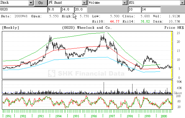
PE BAND
PE Band
is computed from the historical patterns of the Price Earnings Ratio (PE Ratio) for each individual stock. The advantage of the PE Band is its consideration for both the fundamental factor (i.e. profitability) and the historical trading pattern of a stock. The line plotted from the average highest PE will form the upper PE Band, whereas the average lowest PE will form the lower PE Band. The middle PE Band will be derived from the mean of the Upper and Lower Band. In our Java Charting System, appropriate PE Bands have been computed. But if you need to adjust to your favorite PE Band, you can still enter the PE figures in the three boxes as indicated by the cursor as shown below.
The use of PE Band is especially meaningful for listed companies, which have profitable track records. For a stock with stable earnings, its price tends to move within the PE Band. In other words, the stock price in one extreme tends move to the other extreme within the Band. The chart shown as above represents the past ten years' records for "Wheelock and Co". This Chart shows the typical characteristics of a PE Band Chart. We can observe that the price movements of "Wheelock and Co" were moving within the upper and lower PE Band for most of the time. Market expectations about the Group's earnings usually bring an influential effect on the directions of the stock. Thus, sometimes, the price of the stock may run outside the Band. However, when the ultimate outcome of the results announced turns out to be unexpected, market forces will normally drive the price to a reasonable PE level.